

Designing for iOS6 devices is totally different from designing for the web. Here’s how to conceptualize, design, and develop a successful user interface for iPhone.
1. Make a Development Choice
The first choice is Apple SDK. It’s got steep learning curve, cocon and objective C. It uses apps from the Apple SDK which is $99 to join but it’s got a lot of potential to generate a significant income from the Itunes store. There are great books you can find to learn more about Iphone and mobile design and development to such books as “Iphone in Action”, “The Iphone Developer’s Cookbook”, and “Mobile Design and Development”.
Your second choice Web Only App. This uses HTML/CSS techniques with no revenue from the app store. It’s good for clients on lower budgets and can be made to look like a native app.
The third choice is a Hybrid App. There’s app like PhoneGap, Mobile Roadie, and JQTouch. You have to be very careful what you use because sometimes apps get rejected on the basis of not using the SDK.
2. Clearly Define What you Design for the iPhone
You start with an Application Definition Statement (ADS). It is a couple of sentences that describes exactly what your app does. Don’t make large paragraph with every single detail and as coherent to someone who maybe doesn’t understand. Just keep it short and straighforward.
Figure out the best UI components for your application.
The first type of design app is the “Serious Tool” which is a very specific design method. This involves a limited colour palette and focuses on minimising graphics. The most important thing about this type of tool is the data. It contains standard navigation with clear divisions and blocks.
Next is the “Fun Tool”. This involves moderate use of colour and graphics and a simple hierarchy of information. This type of tool encourages leisurely productivity which is very different to the “Serious Tool”.
The third type is Fun Entertainment. These tools are graphically-rich, use a lot of sound, have a simple hierarchy of information, and in-your-face visual feedback.
The fourth one is Serious Entertainment. This type of tool has moderate use of graphics, is focused on content with normally heavy use of tabbed data, and standard navigation elements. This is probably the hardest type of tool to design for.
The fifth app type is Utility. These are graphically rich with normally single screen. It tries to not have a hierarchy and normally used for less than 30 seconds. An example would be a landing page with a “call me now” option.
3. Orientations, Dimensions, and Hierarchy
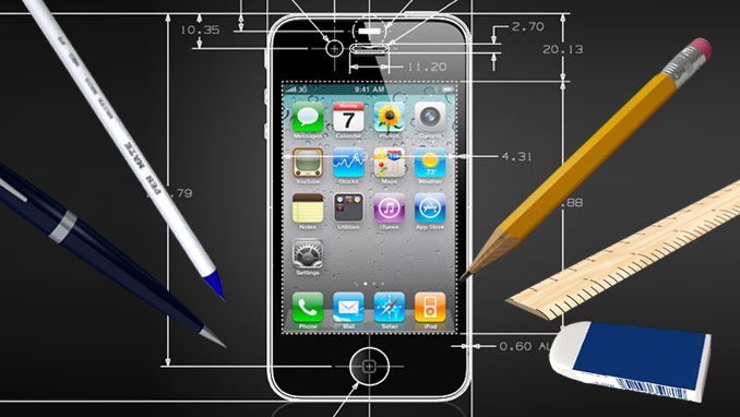
You to need to think about the space for touch gestures, such as buttons. The minimum hit size on an iPhone is 44 x 22px: anything smaller than this and a user might get frustrated with mis-hitting their intended buttons. The ideal fingertip target is a comfortable 44 x 44px. You also have to think about the space between anything a user will need to touch. The recommended minimum space between elements is between 12 and 22px.
4. High Quality iPhone Graphics
You’ll notice that the apps that ship with your iPhone or iPad are of the highest quality, that attention to detail is in abundance and that they’re pleasing to the eye. The apps that get the greatest graphical reviews are those that follow suit. The iPhone and iPad are in such close proximity to your eye level that it’s possible to make the most subtle of textures and gradients noticeable. Flat, block colours can work well but just adding hints of gradients, texture and realism can lift your app from good to fantastic.
Other elements that can make an app beautiful are text highlights, tactile backgrounds, subtle shadows, high gloss finishes and clean, crisp, custom icons within your app (of course, all used sparingly and appropriately).
The best apps are those that get the user interface right, such as the Twitter for iPhone app (formerly Tweetie). The “pull to refresh” has become a standard gesture across many apps and coupled with a beautiful user interface: it’s no wonder it has become a favourite amongst Twitter iPhone users.
5. Take Time to Design a Beautiful Icon
Your app icon is one of the most important things: it will be someone’s first contact with your app on the App Store. The best icons always portray a single, defined silhouette and tell a story of what your app represents.
Spotlight icons are seen on the search screen of the iPhone
Try to leave text out of the icon: it rarely works and is mostly unnecessary as your app name will be presented below the icon anyway.
6. Get your iPhone App Approved
Use purely the Apple SDK if possible. Try not to use the high-breed methods because some of time get rejected and its worth looking into the internet and to read what they tend to adapt.
Don’t use any Apple icons or imagery or any Apple trademarks. Do not use popular stock icons. We want a little bit custom and not something available freely on the internet. Try not to be too controversial; find a language, a hook where you can make a cue and can get it through that way.
Conclusion
The most successful apps fulfill basic needs of people who need to find something quickly. Also when we designing user interfaces for the Iphone, you’ve got one platform, Webkit (there are other browsers but the main one is Webkit) as well as all the constraints of designing for the web.
